Marketing Spend
UX Design | Feature Redesign | Product Design
Marketing Spend helps Spark users manage and budget their marketing campaigns.
Marketing Spend helps Spark users manage and budget their marketing campaigns.
A feature Spark users have requested for years was a dashboard that tracked marketing campaigns, how much was being spent on them and how they were performing. The team took a first swing at the Marketing Spend tool before I joined Spark, however feature bloat and lack of clear design direction led to a first iteration that did not effectively solve the problem.
My role was to dig into the existing feature, audit the UI and evaluate the existing interaction model. Once that initial audit was complete I redesigned the user flows, and design assets to bring this tool in line with the broader Spark UI.
The model of marketing campaigns within Sparks is as follows: A campaign has a source, and the source lives inside a preset category.

The existing campaign and budget structure.
In the current modal each of these objects have their own budget and live in siloed subpages. If there's a discrepancy in these budgets, Spark throws up one of the following errors.
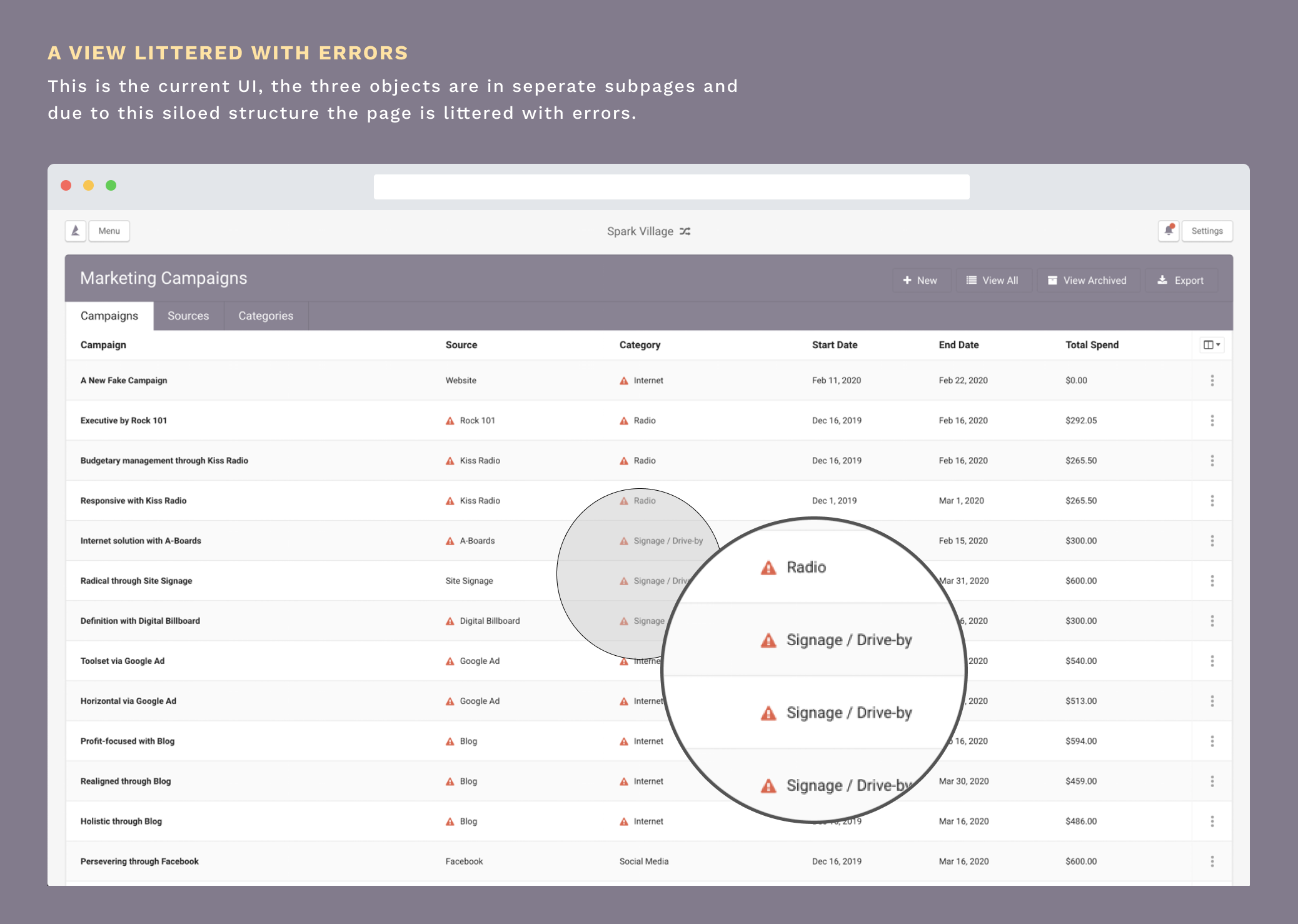
The category has a lower budget than it’s sourceThe source has a lower budget than the cost of the campaignThe campaign costs more than the budget of the source or categorySince these budgets have no relation to one another these errors happened quite frequently, leaving users with a UI littered with errors (Fig 1.) Pair this with the fact that each of these objects were siloed in their own subpage users struggled, and had no clear actions on how to deal with their campaigns.

Fig 1. Existing marketing spend dashboard riddled with budgeting errors.

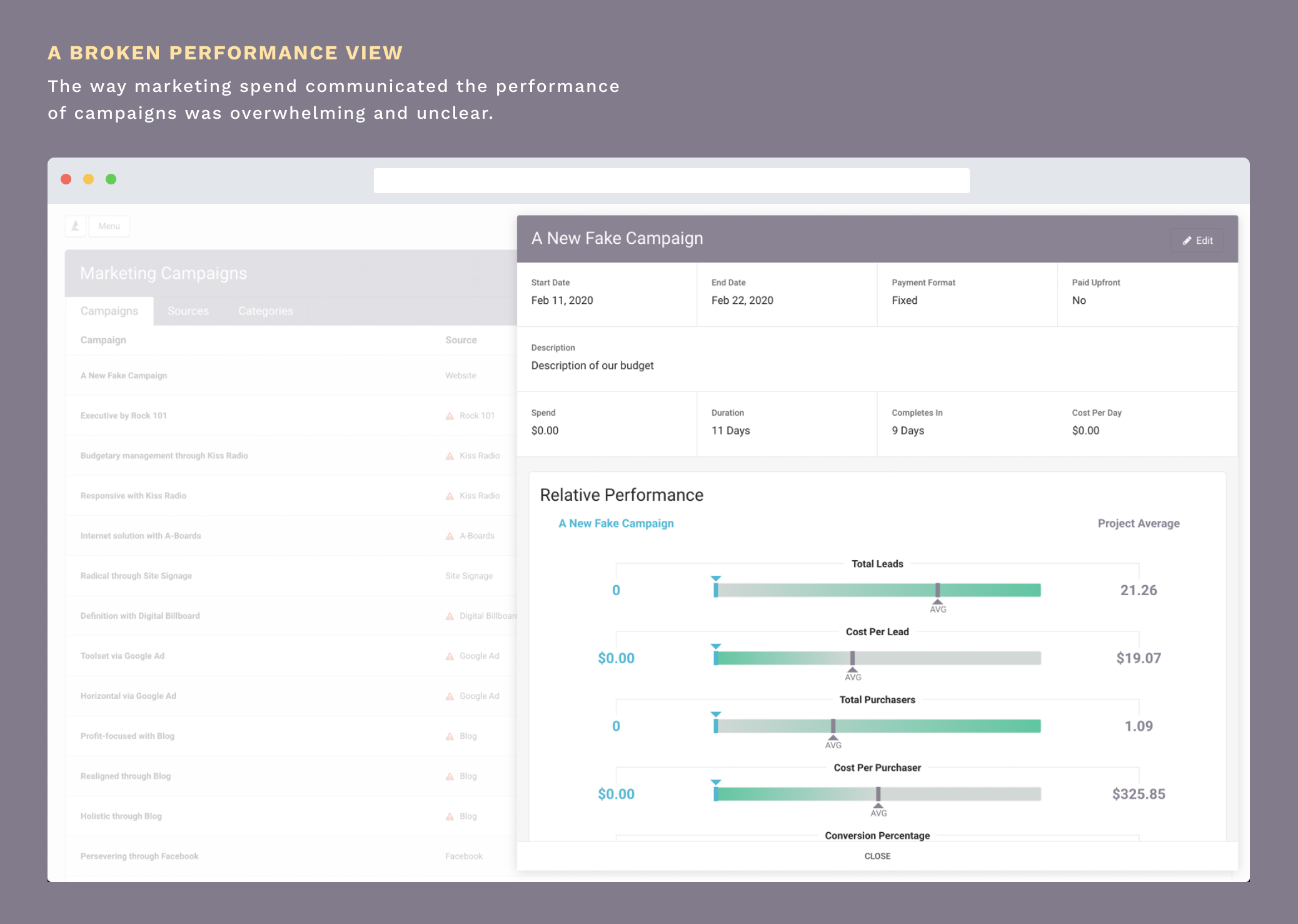
Fig 2. Existing Performance view for each campaign
I worked with the team to break down Marketing Spend into the most essential workflows. This would allow me to optimize the experience for key actions and strip away the excess for a revised MVP.
1. I want to set my category budgets and create a new source.
2. I want to create a new marketing campaign within that source.
3. I want to see how my campaign is performing.
With the workflows defined the goal now was to streamline the UI. The first priority was to ensure the UI reflected the hereditary nature of both the budget and the structure of our 3 objects.
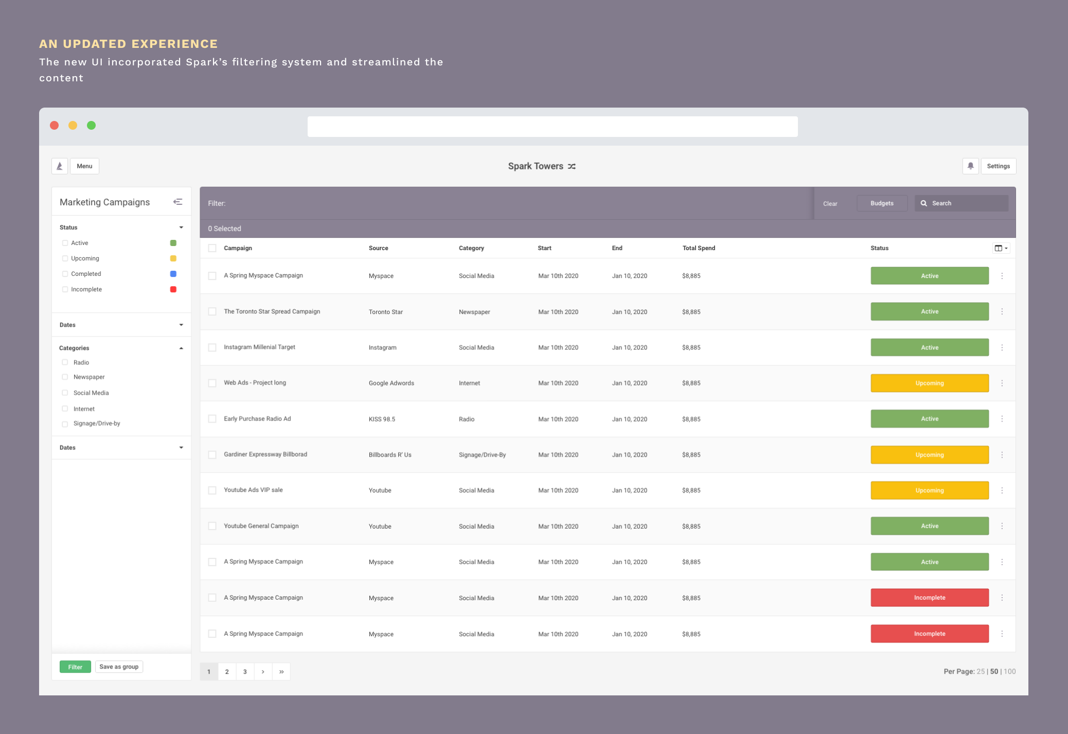
Campaigns → Source → CategoriesWe did this be stripping away the subpages so that the primary list view was centred around the campaigns themselves. Our list filtering system served as the primary way for users to pare down the list based on categories and sources.

The major issue left to be addressed was how users could view the budgets of sources and categories. With my lead’s guidance I designed on an entirely new design pattern for Spark. A dropdown panel that served as a quick view which would help users visualize budgets for categories and their respective sources.
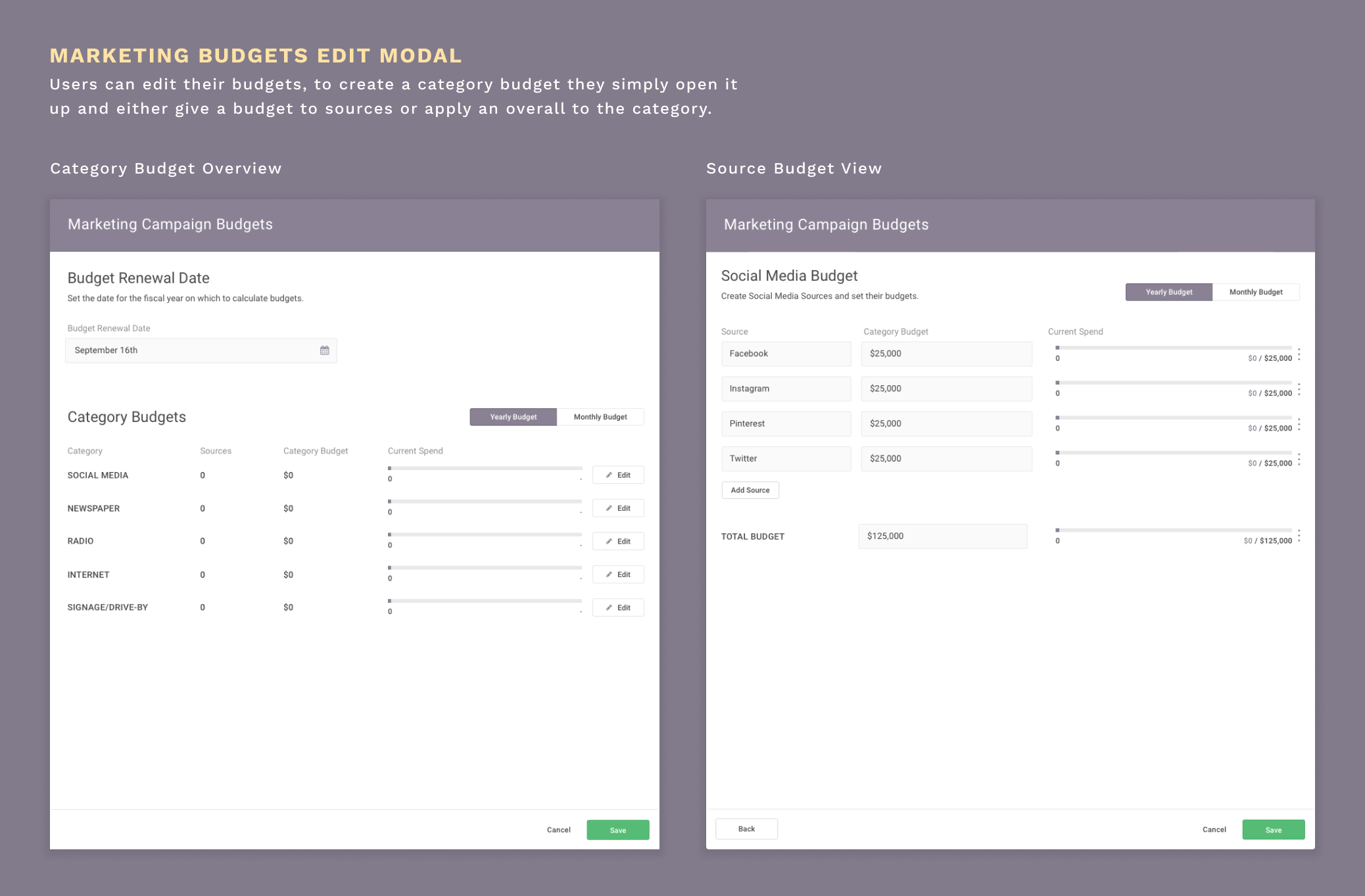
With the quick view defined the next challenge was defining the way users could edit and structure their budgets. For this we stuck with a familiar UI pattern, utilizing the standard Spark modal. Here, users could set the budget reset date, and go in and make any edits. Since we were now implementing an additive structure, the category budget could be set manually or be automatically generated by giving each source a budget within a category.

Now it was just a question of putting it all together, this is how I addressed the key user flows outlined above.
I want to set my category budgets and create a new source.To guide our users and minimize future inconsistencies we prompt users with a primary CTA to first create their budgets.
I want to create a new marketing campaign within that source.Creating a campaign inside a source that doesn’t have a budget will add the budget unless the user specifically indicates it shouldn’t.
I want to see how my campaign is performing.The user can view the campaign information and performance statistics and make any edits they require.

Once this feature goes into production, it’ll be important to measure our success. Measuring the following parameters will be important in doing so.
The number of marketing campaigns tracked on Spark.A substantial reduction in budget conflicts.How many reports are created pertaining to marketing campaignsWhile this project is currently tabled as our dev team knocks out some higher priority tasks, it was quite a fascinating challenge to redesign a feature that was already built. This required a much higher degree of intentionality when defining what features could be cut out from the previous version, what features were important in including the MVP, and what could be put aside for a future iteration.
It involved a high degree of systems based thinking – a skillset I am still continuing to build, it was quite a challenge to define the objects and how they work with one another.